A trust-first way to think about visual identity
- Expectations: Color and basic styling tell people what kind of experience to expect—steady and sober, or energetic and fast.
- Evidence: Symbols (logos, marks, icons) and consistent styling across surfaces prove you are who you say you are.
- Ease: Subtle interface signals—layout, navigation, trust statements, contact visibility—reduce uncertainty and make action feel safe.
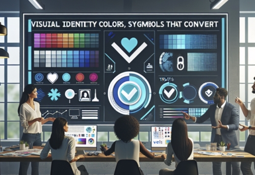
Color: your first expectation engine Color is one of the few brand decisions every viewer feels immediately. It needs to match your audience and the temperament of the job they hire you for.
- Map to personality and audience: energetic, exciting, interesting? Red, orange, or yellow can carry that energy. If you need to convey confidence and stability, neutrals do the job; blue and green read as stable and calming. Targeting children or fast‑paced settings? Primary colors and high‑contrast pairings (think opposite colors like orange/blue or yellow/red) communicate speed and clarity. Targeting women with a refined offer? Pastels and low‑contrast accents can telegraph poise and confidence .
- Keep color governance tight: Decide color values once and document them. Define print and web values for your palette, so the same blue is the same blue on deck, web, and invoice—a small, compounding signal of reliability .
Symbols: compress proof into a mark A good mark isn’t decoration; it’s a compact proof of identity that survives at postage‑stamp sizes and in high-speed scans.
- Aim for simplicity with meaning: The most “sticky” symbols reduce the brand’s essence to a clear form people can recognize at a glance and recall later. Use the discipline of translating core values into an icon or mark; then test if neutral observers can describe what it makes them expect without reading any words .
- Choose legible typography for the medium: Favor sans‑serif for primarily web use; serif where the brand lives mostly in print. Then lock typefaces and sizes in a style template so the whole organization renders the brand the same way every time (trust loves consistency) .
Signals that convert: what buyers look for before they act Trust is often won or lost in the first screenful. These visible cues de‑risk action:
- Placement and polish: Put a sharp, professional logo at the top and keep the design clear and simple with plenty of white space. Keep colors consistent page to page; inconsistency feels like sloppiness, which reads as risk .
- Navigation that feels safe: Consistent menus across the site, 7–9 links max in the primary bar, and the “three‑click” rule for core content reduce the sense of getting lost. Add a site search and/or a site map to give every visitor a safety rope .
- Proof and policy where people expect it: Make privacy statements and a brief note on security easy to find. Include testimonials and case studies. Provide a direct phone number on a dedicated Contact page. These are classic trust surfaces buyers check before committing .
- Performance as a trust cue: Quick load speed and easy use are among the top features visitors value. Slow, clunky, or visually noisy pages feel risky—even when the product is strong—because friction suggests future pain .
Authenticity beats polish when trust is scarce At a global level, customers trust brand‑produced messages less than ever; they look for consistency between what you say and what others say about you. Brand images that openly reflect responsibility, accountability, and responsiveness sustain trust longer than flashy claims do. Crucially, the perception of authenticity must be in place before any reputational shock; it cannot be retrofitted mid‑crisis .
For e‑commerce, human cues and channel coherence help. Research shows more human‑like on‑screen characters can increase likeability and trust in some contexts, and tight online–offline integration (one identity, many channels) gives customers choice while reinforcing one coherent experience—both of which support trust at checkout .
Standardize the core, adapt the edges If you work across markets, decide what must be visually consistent everywhere and what can flex to local norms.
- The 70/30 mindset: Keep a large majority of your identity consistent (core palette, logo, basic layout grammar), while allowing a smaller portion to adapt to local expectations—especially in imagery and cultural symbols. That balance preserves recognition while preventing cultural misfires .
- Cross‑cultural design: Some brands choose highly standardized layouts across countries; others localize values, appeals, and symbols. Either way, aim for one clear meaning with room for relevant nuance, not a completely different “face” per region .
Governance: document once, trust always A style guide isn’t bureaucracy; it’s how you ship trust at scale.
- Write the rules: Fonts, sizes, color values (web and print), logo spacing, image tone—codify them. This reduces errors and presents a united persona to both customers and staff .
- Make the guide usable: Think of the guide as a “brand imaging system”—the practical, everyday bible of logo treatment, approved copy conventions, and visual patterns that carry from web to sales decks to PR placements. In B2B, codifying this system measurably improves perceived professionalism and sales opportunities .
- Keep it current: As your offer evolves, refresh brand and reputation research so your identity still reflects what you sell and how you behave. Attributes get stale; strong visual identity work tracks real change over time, not just tastes .
A visual trust audit you can run this week
- Above the fold: Does the header instantly reassure? Professional logo, consistent color, uncluttered layout, and obvious navigation? If any element looks off‑brand, fix it first .
- Findability of reassurance: Can a new visitor, in under 10 seconds, find your privacy/security notes, contact number, and a credible testimonial or case study? If not, promote them to visible positions .
- Color discipline: Are brand colors identical across web, PDF, and print? If you don’t have documented values, create them now and update your templates .
- Navigation sanity: Count the top‑level links; trim to 7–9, and add a site search or site map if discovery feels effortful. Ensure key tasks are within three clicks .
- Performance pass: Test load speed on mobile. Visual weight is a trust tax—optimize assets so “fast” becomes part of how you look and feel .
- Cross‑channel check: Place screenshots of your website, LinkedIn banner, proposal cover, and invoice side by side. Do they look like one brand in tone, color, and typography? If not, the guide needs tightening (or adoption needs enforcing) .
Design principles to avoid costly missteps
- Don’t let gimmicks outrun usefulness: Splash pages, frames, and heavy visuals that delay access are exit cues. Keep the path to content short and obvious .
- Avoid stocky clichés: Generic imagery (like call‑center models with headsets) signals “template,” not “trusted.” Favor real people, real spaces, or abstracted brand forms that fit your tone .
- Resist visual drift: When a sales deck invents a shade of your blue or a team swaps fonts “just for this event,” trust erodes. The guide exists to prevent this; use it .
The deeper insight Visual identity is not paint on the surface; it’s proof on contact. The right colors set expectations your delivery can meet. The right symbols compress who you are into something people recognize under time pressure. The right signals remove the last doubts between interest and action. Do those three consistently and you don’t just look trustworthy—you become easier to trust, which is why you convert.